Over the course of the past two years, I have been asked how does the WP International Tee Designs get designed? Here, I will be sharing a case study of the San Francisco design process that we go through here at the Panda camp.
San Francisco
The Brief: To design something which the team will wear in San Francisco, represent the WP, has USA influence and make us stand out from the rest of the crew. I want our International Tees to be different colour to our home kit and makes us stand out from the other teams. I felt our team should be represented in a strong, vivid colour to represent our team spirit and personality.
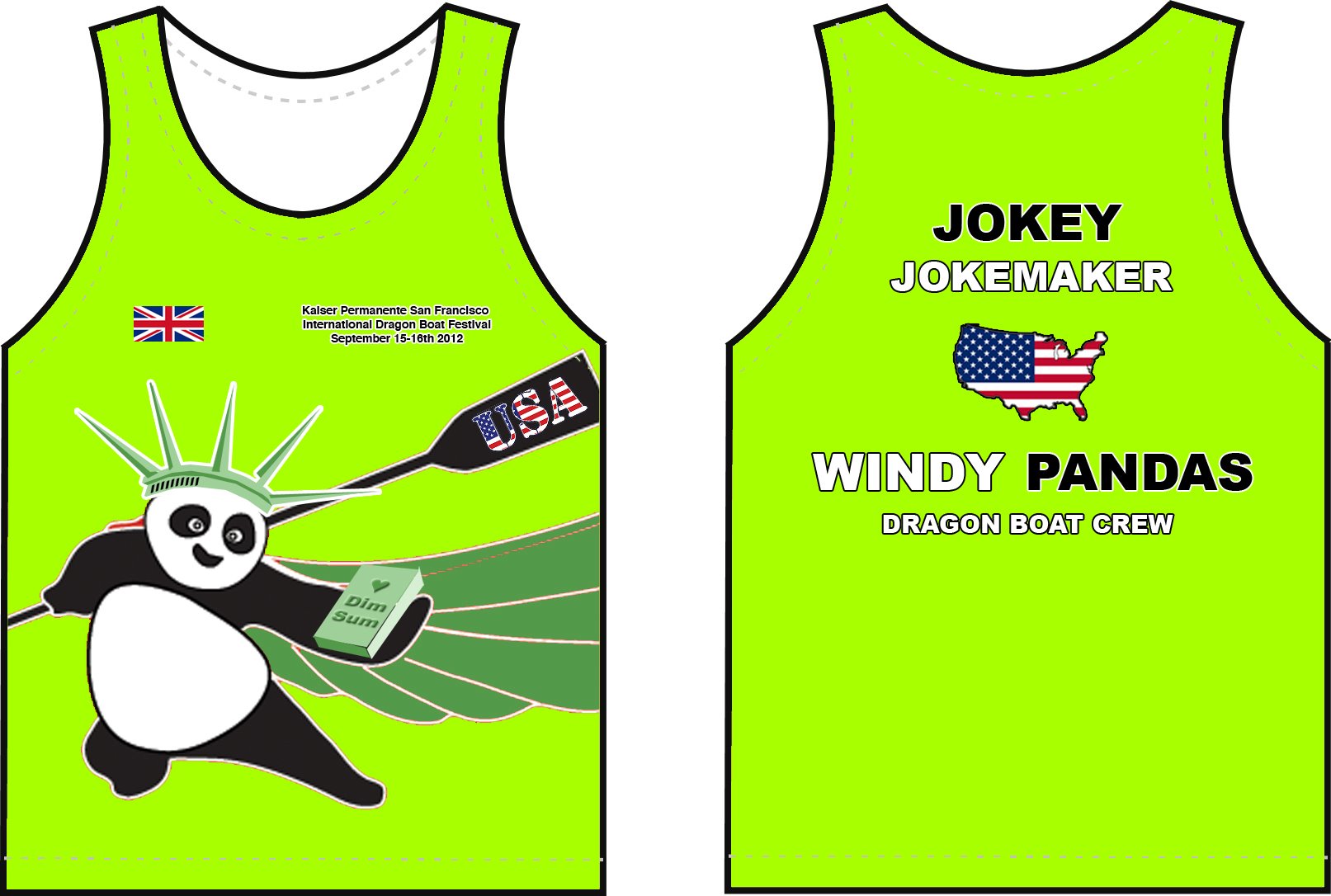
Here are some initial designs created a few months before the trip, probably looking around May 2012. The San Francisco event was in September 2012 but its always good to get the designs down early to refine and to improve.


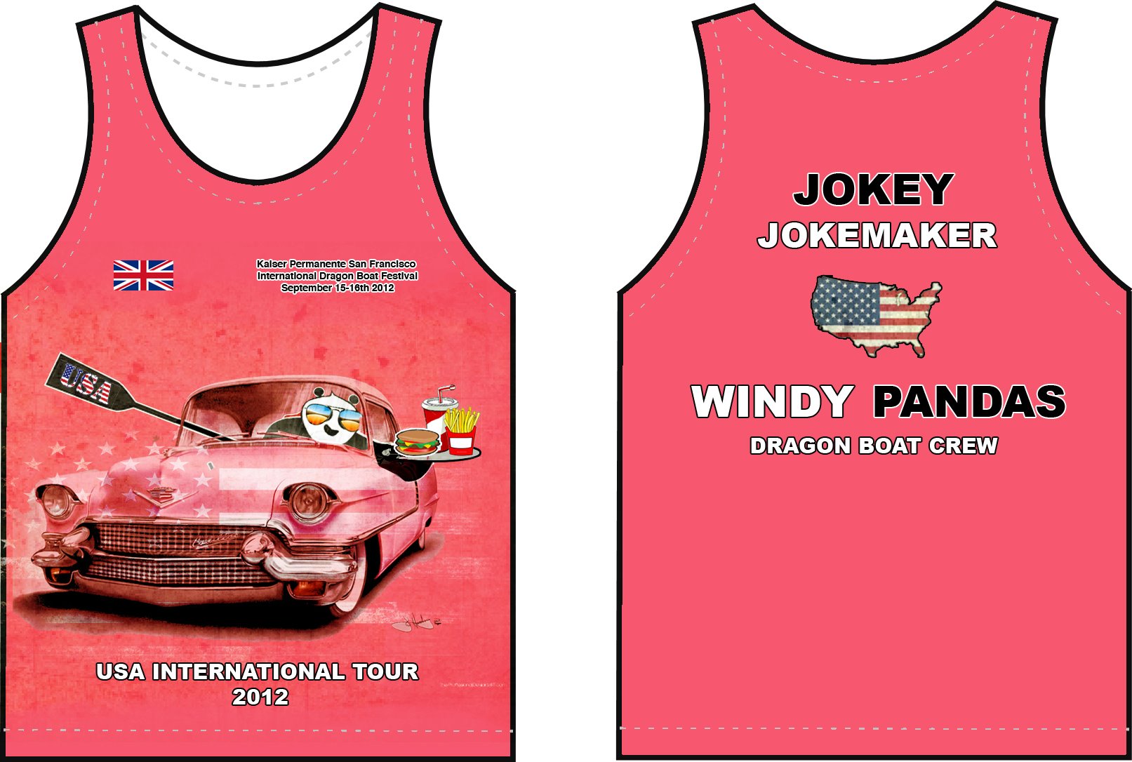
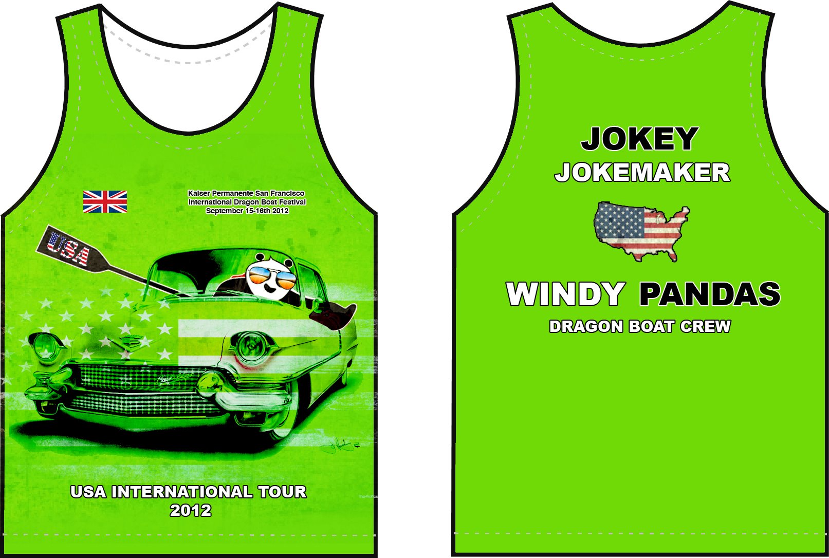
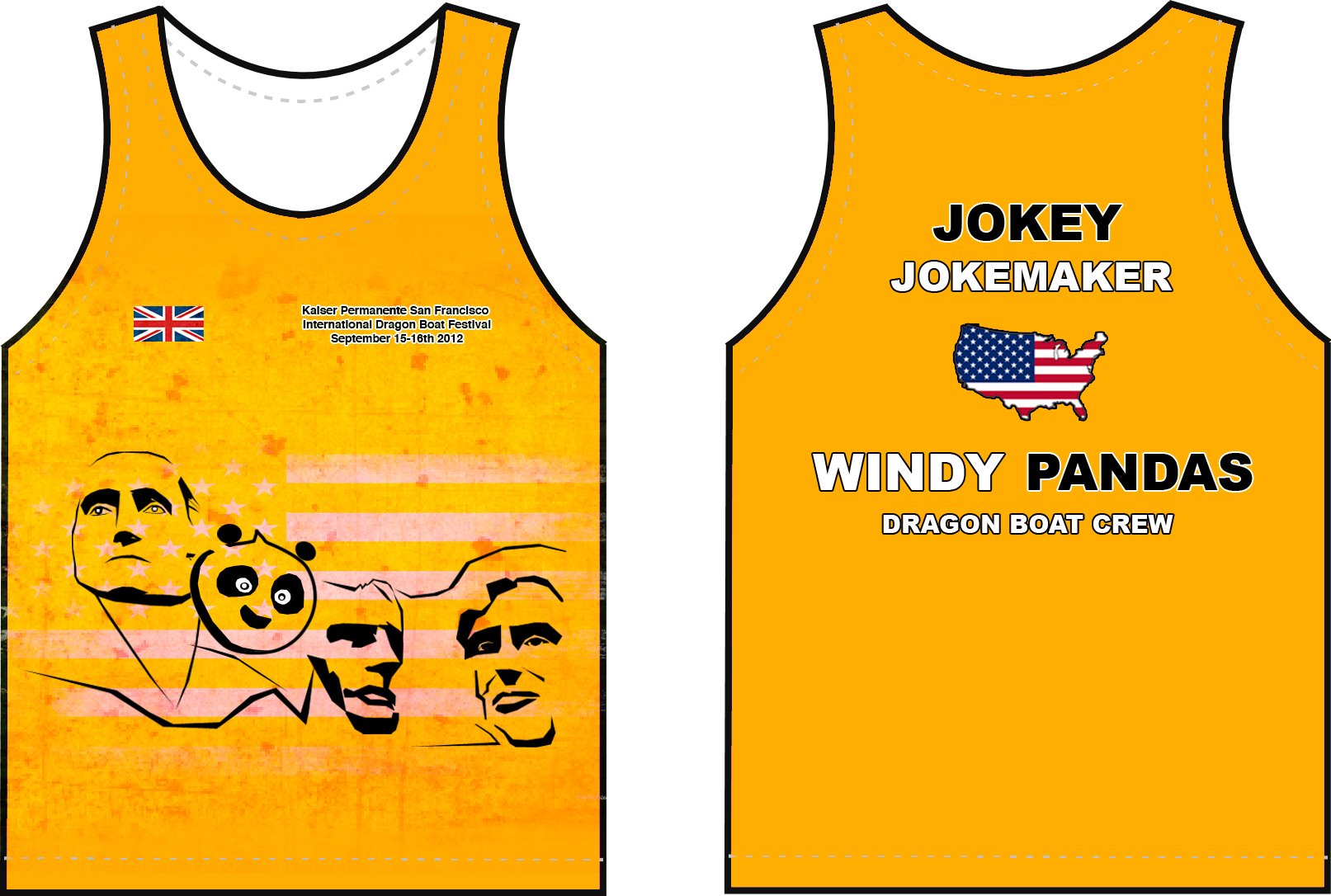

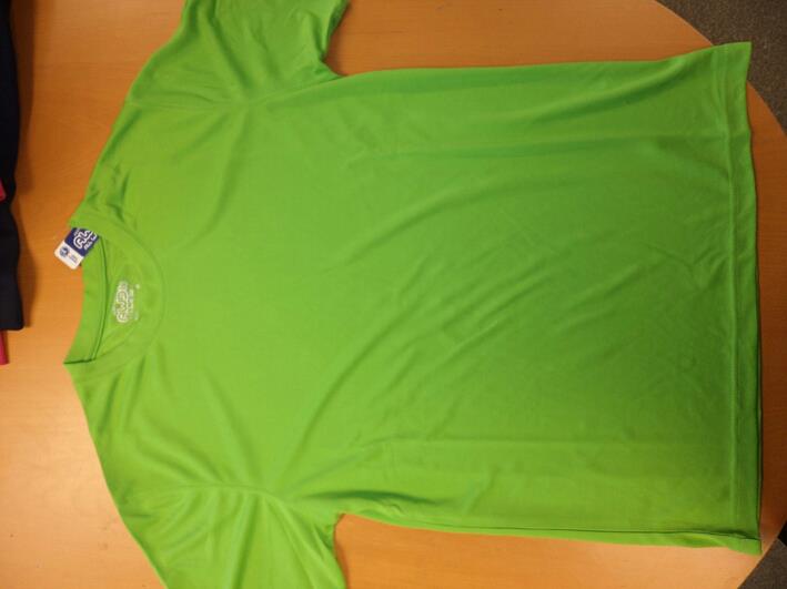
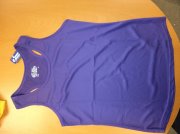
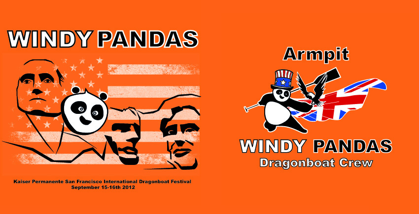
We then went to a vote to see which designs the team liked best. The Cowboy and Mount Rushmore were proving popular but what made the decision in the end, was the printing process. It proved to be a pain and expensive with the cowboy design, so we ended up with the Mount Rushmore design by cost implications. Here are some samples we got sent before deciding on the final colours, which is always important for us. Sometimes, you cannot tell how the tee shirt colour will look, so we had to pay for one offs to be printed to see how the designs will look. As you can see, the colours were not subtle and we opted for orange in the end.
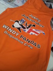

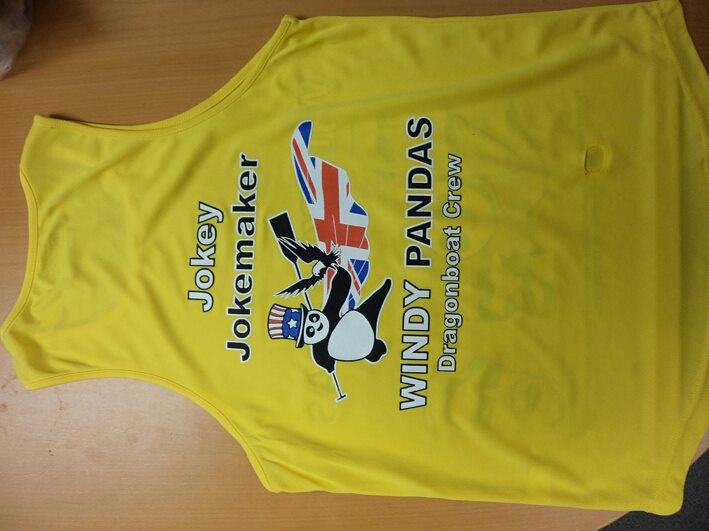
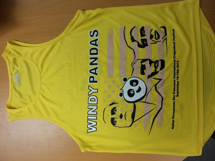
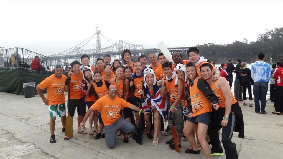
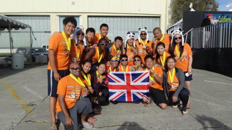
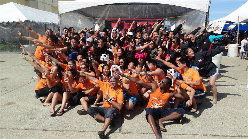
And the final design worn in San Francisco! From the initial sketches all the way till final production, the design process probably took around four, five months. Looking back, I felt it was more than worthwhile seeing how good we looked out there. So much so, we have some orders from our new found American friends 🙂
Chairman Jokey-Jokemaker
